

|

Vodafone Group Plc is a British multinational telecommunications company headquartered in London, United Kingdom.It is the world's largest mobile telecommunications company measured by revenues and the world's second-largest measured by subscribers (behind China Mobile), with over 391 million subscribers as of September 2011.
Vodafone owns and operates networks in over 30 countries and has partner networks in over 40 additional countries. It owns 45% of Verizon Wireless, the largest mobile telecommunications company in the United States measured by subscribers. The name Vodafone comes from voice data fone, chosen by the company to "reflect the provision of voice and data services over mobile phones".
Mozilla
The animal shown in the logo is a stylized fox, although "firefox" is considered to be a common name for the red panda. The panda, according to Hicks, "didn't really conjure up the right imagery" and wasn't widely known.[12] The logo was chosen to make an impression while not shouting out with overdone artwork. It had to stand out in the user's mind, be easy for others to remember, and stand out without causing too much distraction when seen among other icons.
The Firefox icon is a trademark used to designate the official Mozilla build of the Firefox software and builds of official distribution partners. For this reason, Debian and other software distributors who distribute patched or modified versions of Firefox do not use the icon. The crash reporting service was initially closed source, but switched with version 3 from a program called Talkback to the open source BreakPad & Socorro.
IBM

In 1911, the International Time Recording Company (ITR, est. 1888) and theComputing Scale Company (CSC, est. 1891) merged to form the Computing-Tabulating-Recording Company (CTR, see where IBM gets its penchant for three letter acronym?). In 1924, the company adopted the name International Business Machines Corporation and a new modern-looking logo. It made employee time-keeping systems, weighing scales, meat slicers, and punched-card tabulators.
In the late 1940s, IBM began a difficult transition of punched-card tabulating to computers, led by its CEO Thomas J. Watson. To signify this radical change, in 1947, IBM changed its logo for the first time in over two decades: a simple typeface logo.
In 1956, with the leadership of the company being passed down to Watson’s son, Paul Rand changed IBM’s logo to have "a more solid, grounded and balanced appearance" and at the same time he made the change subtle enough to communicate that there’s continuity in the passing of the baton of leadership from father to son.
IBM logo’s last big change – which wasn’t all that big – was in 1972, when Paul Rand replaced the solid letters with horizontal stripes to suggest "speed and dynamism."
Adobe
In 1982, forty-something programmers John Warnock and Charles Geschke quit their work at Xerox to start a software company. They named it Adobe, after a creek that ran behind Warnock’s home. Their first focus was to create PostScript, a programming language used in desktop publishing.
When Adobe was young, Warnock and Geschke did everything they could to save money. They asked family and friends to help out: Geschke’s 80-year-old father stained lumber for shelving, and Warnock’s wife Marva designed Adobe’s first logo.
Apple
In 1976, Steve Wozniak and Steve Jobs ("the two Steves") designed and built a homemade computer, the Apple I. Because Wozniak was working for Hewlett Packard at the time, they offered it to HP first, but they were turned down. The two Steves had to sell some of their prized posessions (Wozniak sold his beloved programmable HP calculator and Jobs sold his old Volkswagen bus) to finance the making of the Apple I motherboards.
Later that year, Wozniak created the next generation machine: Apple ][ prototype. They offered it to Commodore, and got turned down again. But things soon started to look up for Apple, and the company began to gain customers with its computers.
The first Apple logo was a complex picture of Isaac Newton sitting under an apple tree. The logo was inscribed: "Newton … A Mind Forever Voyaging Through Strange Seas of Thought … Alone." It was designed by Ronald Wayne, who along with Wozniak and Jobs, actually founded Apple Computer. In 1976, after only working for two weeks at Apple, Wayne relinquished his stock (10% of the company) for a one-time payment of $800 because he thought Apple was too risky! (Had he kept it, Wayne’s stock would be worth billions!)
Jobs thought that the overly complex logo had something to do with the slow sales of the Apple I, so he commissioned Rob Janoff of the Regis McKenna Agency to design a new one. Janoff came up with the iconic rainbow-striped Apple logo used from 1976 to 1999.
Rumor has it that the bite on the Apple logo was a nod to Alan Turing, the father of modern computer science who committed suicide by eating a cyanide-laced apple. Janoff, however, said in an interview that though he was mindful of the "byte/bite" pun (Apple’s slogan back then: "Byte into an Apple"), he designed the logo as such to "prevent the apple from looking like a cherry tomato." (Source)
In 1998, supposedly at the insistence of Jobs, who had just returned to the company, Apple replaced the rainbow logo ("the most expensive bloody logo ever designed" said Apple President Mike Scott) with a modern-looking, monochrome logo.
In 1996, Stanford University computer science graduate students Larry Page and Sergey Brin built a search engine that would later become Google. That search engine was called BackRub, named for its ability to analyze "back links" to determine relevance of a particular website. Later, the two renamed their search engine Google, a play on the word Googol (meaning 1 followed by 100 zeros).
LG


LG began its life as two companies: Lucky (or Lak Hui) Chemical Industrial (est. 1947), which made cosmetics and GoldStar (est. 1958), a radio manufacturing plant. Lucky Chemical became famous in Korea for creating the Lucky Cream, with a container bearing the image of the Hollywood starlet Deanna Durbin. GoldStar evolved from manufacturing only radios to making all sorts of electronics and household appliances.
In 1995, Lucky Goldstar changed its name to LG Electronics (yes, a backronymapparently not). Actually, LG is a chaebol (a South Korean conglomerate), so there’s a whole range of LG companies that also changed their names, such as LG Chemicals, LT Telecom, and even a baseball team called the LG Twins. These companies all adopted the "Life is Good" tagline you often see alongside its logo.
Interestingly, LG denies that their name now stands for Lucky Goldstar… or any other words. They’re just "LG."
Canon
In 1930, Goro Yoshida and his brother-in-law Saburo Uchida created Precision Optical Instruments Laboratory in Japan. Four years later, they created their first camera, called the Kwanon. It was named after the Kwanon, Buddhist Bodhisattva of Mercy. The logo included an image of Kwanon with 1,000 arms and flames.
Coolness of logo notwithstanding, the company registered the differently spelled word "Canon" as a trademark because it sounded similar to Kwanon while implying precision, a characteristic the company would like to be known and associated with.
Microsoft

Microsoft’s "groovy logo" source: Coding Horror
In 1975, Paul Allen (who then was working at Honeywell) and his friend Bill Gates (then a sophomore at Harvard University) saw a new Altair 8800 of Micro Instrumentation and Telemetry Systems or MITS. It was the first mini personal computer available commercially.
Allen and Gates decided to port the computer language BASIC for the computer (they did this in 24 hours!), making it the first computer language written for a personal computer. They approached MITS and ended up licensing BASIC to the company. Shortly afterwards, Allen and Gates named their partnership "Micro-soft" (within the year, they dropped the hyphen). In 1977, Microsoft became an official company with Allen and Gates first sharing the title general partners.
On to the logo history:
In 1982, Microsoft announced a new logo, complete with the distinctive "O" that employees dubbed the "Blibbet." When the logo was changed in 1987, Microsoft employee Larry Osterman launched a "Save the Blibbet" campaign but to no avail. Supposedly, way back when, Microsoft cafeteria served "Blibbet Burger," a double cheeseburger with bacon.
In 1987, Scott Baker designed the current, so-called "Pac-Man Logo" for Microsoft. The new logo has a slash on the ‘O’ that made it look like Pac-Man, hence the name. In 1994 Microsoft introduced a new tagline Where do you want to go today?, as part of a $100 million advertising campaign. Needless to say, it was widely mocked.
In 1996, perhaps tired of being the butt of jokes like "what kind of error messages would you like today?", Microsoft dropped the slogan. Later, it tried on new taglines like "Making It Easier", "Start Something", "People Ready" and "Open Up Your Digital Life" before settling on the current "Your potential. Our passion."
NOKIA
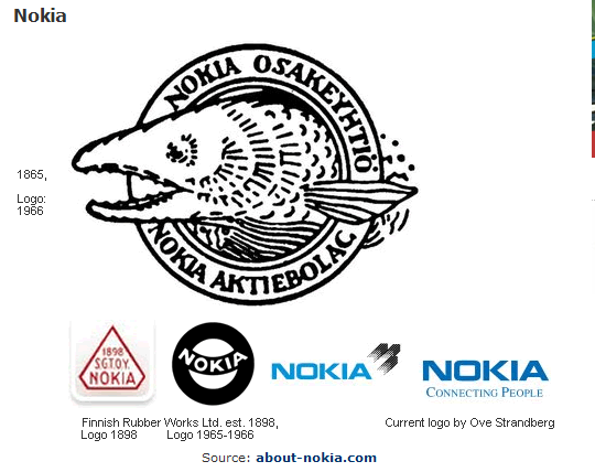
Source: about-nokia.com
In 1865, Knut Fredrik Idestam established a wood-pulp mill in Tampere, south-western Finland. It took on the name Nokia after moving the mill to the banks of the Nokianvirta river in the town of Nokia. The word "Nokia" in Finnish, by the way, means a dark, furry animal we now call the Pine Marten weasel.
The modern company we know as the Nokia Corporation was actually a merger between Finnish Rubber Works (which also used a Nokia brand), the Nokia Wood Mill, and the Finnish Cable Works in 1967.
Before focusing on telecommunications and cell phones, Nokia produced paper products, bicycle and car tires, shoes, television, electricity generators, and so on.

Palm Computing Inc. was founded in 1992 by Jeff Hawkins, who also invented the Palm Pilot PDA. The company has gone through some rough patches in its history: its first PDA called Zoomer was a commercial flop. Next, it was bought out by U.S. Robotics who was promptly sued by Xerox for patent infringement over its Graffiti handwriting recognition technology.
Then it gets convoluted: U.S. Robotics was bought by 3Com, and Hawkins, disgusted with office politics, left to create his own company Handspring. Ironically, not long after he left, 3Com spun off Palm Inc as a separate company. Palm Inc split into two, PalmSource (the OS side) and palmOne (the hardware part). palmOne then mergedwith Handspring and then bought PalmSource to coalesce back into … Palm, Inc.!
Got that? No? Never mind. All along this journey, they not only change names, but logos as well. Well, at least the graphics designers got some money.

Xerox Corporation can trace its lineage back almost 100 years ago to the Haloid Company, which was founded in 1906 to manufacture photographic paper and equipment.
In 1938, Chester Carlson invented a photocopying technique called electrophotography, which he later renamed xerography (Carlson was famous for his persistence: he experimented for 15 years and through debilitating back pain while going to law school and working his regular job). Like many inventions ahead of its time, it wasn’t well received at all. Carlson spent years trying to convince General Electric, IBM, RCA, and other companies to invest in his invention but no one was interested.
Until, that is, he went to the Haloid company, who helped him develop the world’s first photocopier, the Haloid Xerox 914. The copier were so successful that in 1961, Xerox dropped the Haloid from its name.
In 2004, fresh from a settlement with the Securities and Exchange Commission for cooking the books, Xerox tried to re-invent itself (complete with a new logo). Four years later in 2008, it tried to get away from the image that it’s only a copier company and adopted a new logo. The good news is people don’t think of copier when they see the new logo. The bad news is, they think of a beach ball.

Motorola, then Galvin Manufacturing Corporation, was started in 1928 by Paul Galvin. In the 1930s, Galvin started manufacturing car radios, so he created the name ‘Motorola’ which was simply the combination of the word ‘motor’ and the then-popular suffix ‘ola.’ The company switched its name in 1947 to Motorola Inc. In the 1980s, the company started making cellular phones commercially.
The stylized "M" insignia (the company called it "emsignia") was designed in 1955. A company leader said that "the two aspiring triangle peaks arching into an abstracted ‘M’ typified the progressive leadership-minded outlook of the company." (I’m serious, look up the logo-speak here: Motorola History)
Comments
Post a Comment